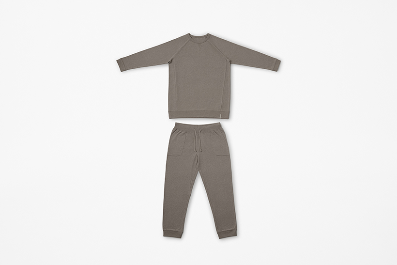
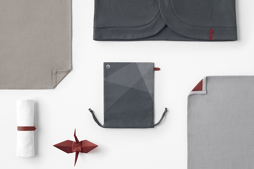
inflight amenity kit
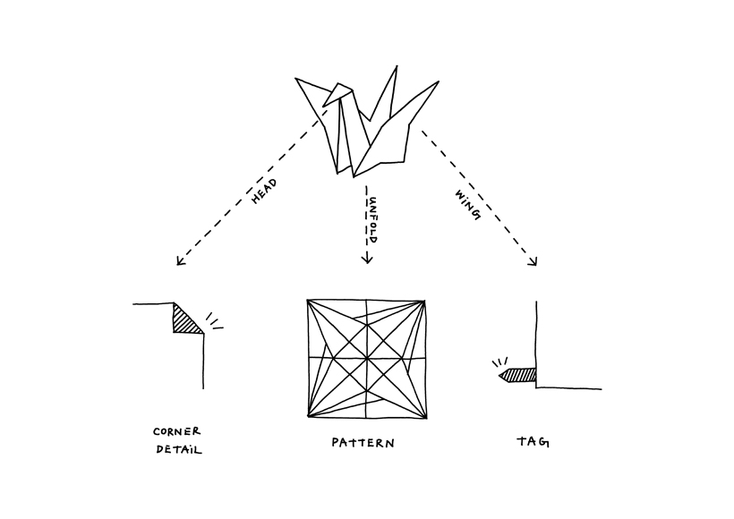
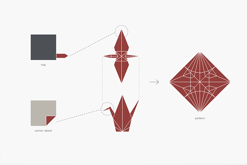
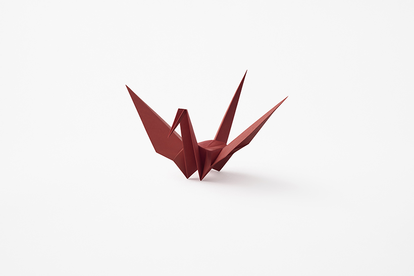
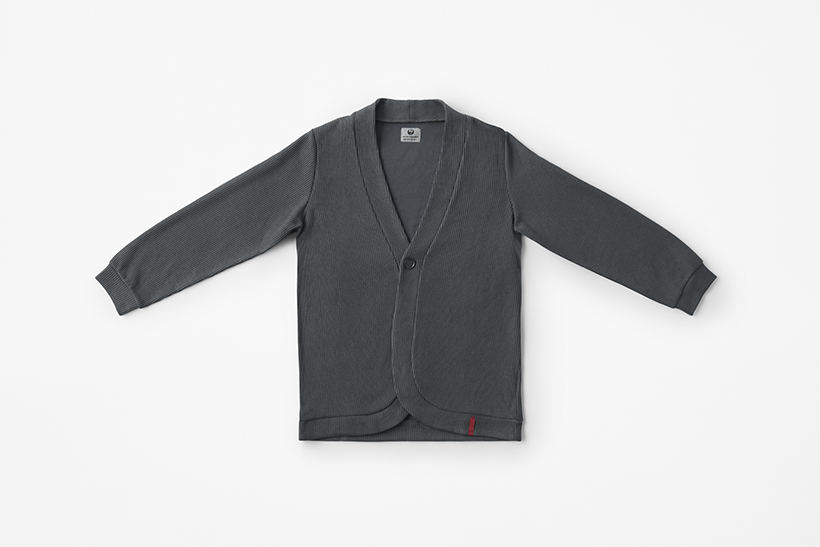
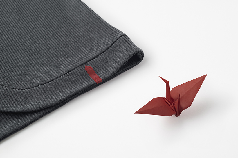
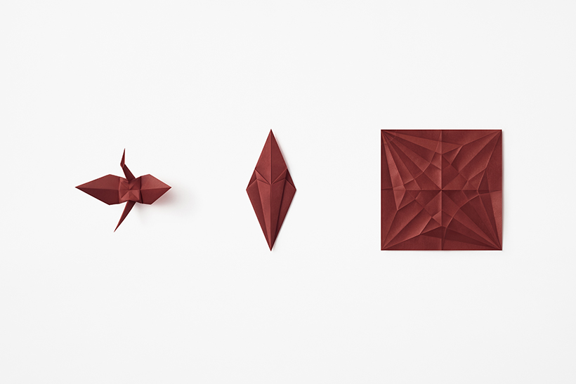
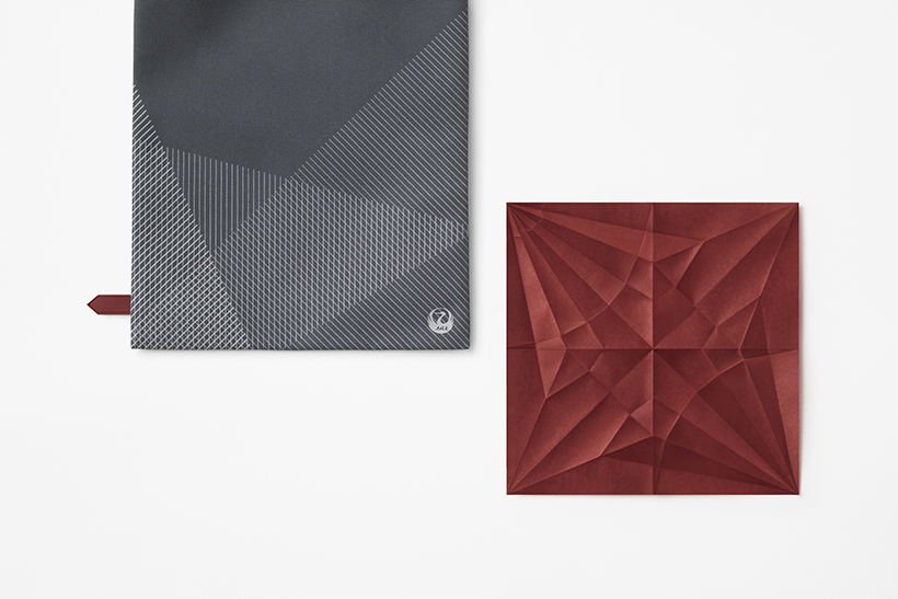
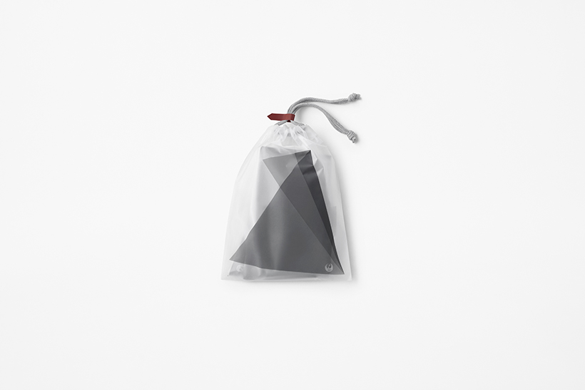
Designs for domestic and international in-flight amenities that Japan Airlines (JAL) offers. The red crane spreading its wings across the sky in JAL’s logo, tsurumaru (“crane circle”), is depicted as a red folded paper crane, a symbol of peace, prayer, and the spirit of hospitality.
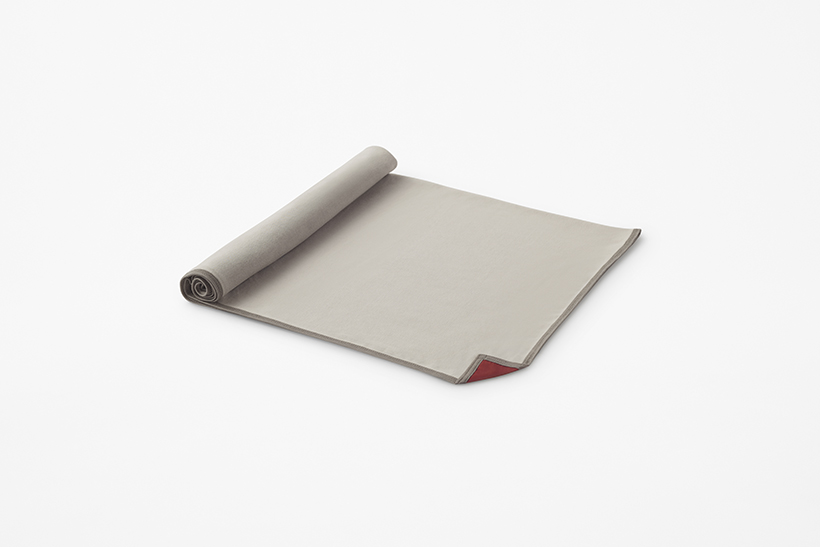
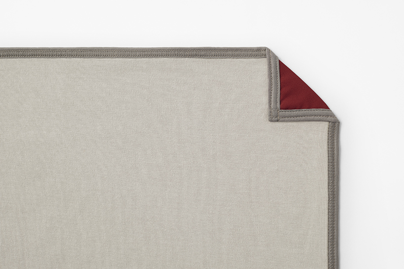
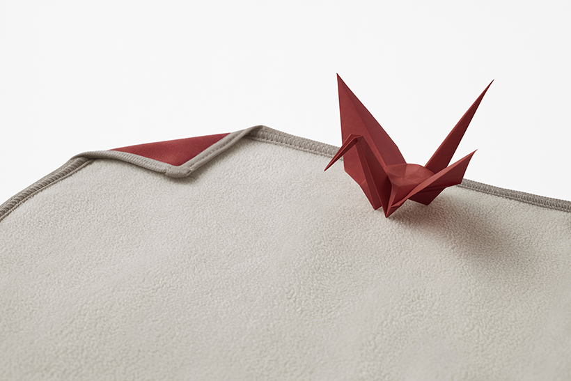
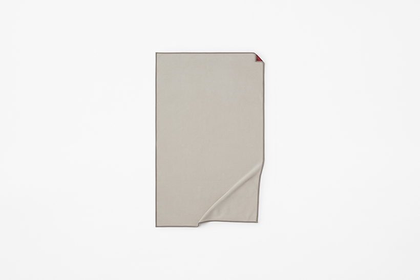
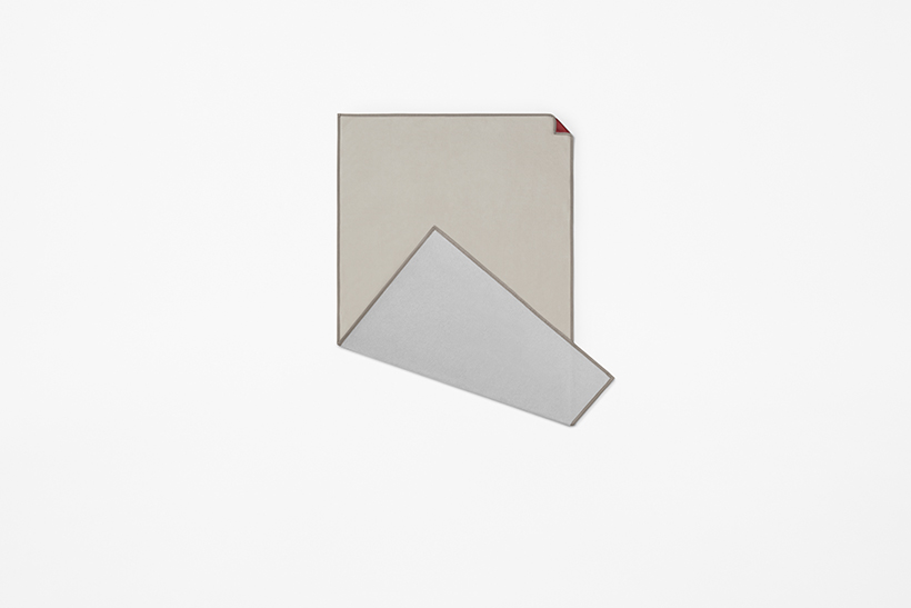
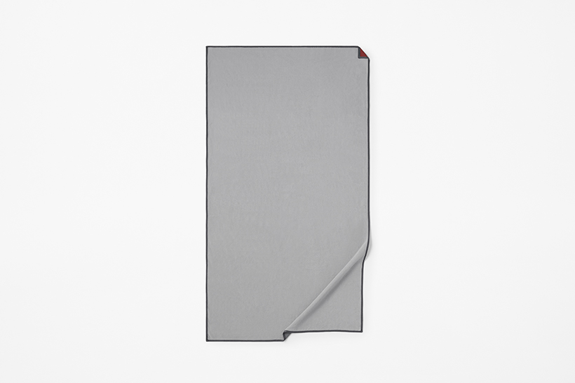
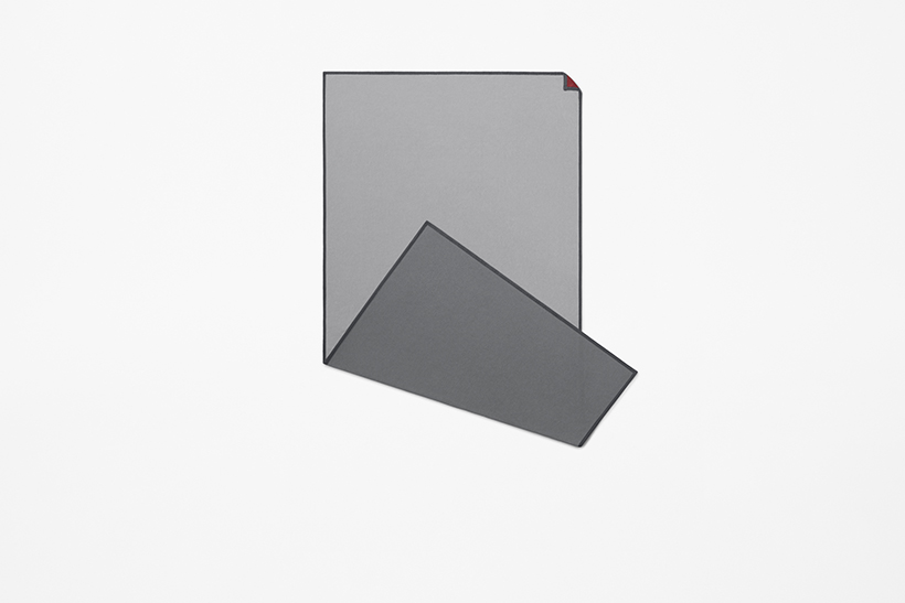
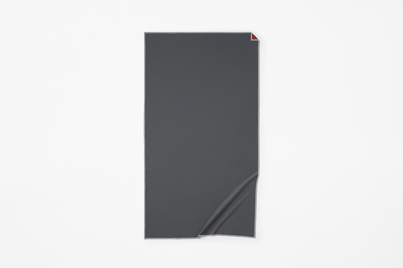
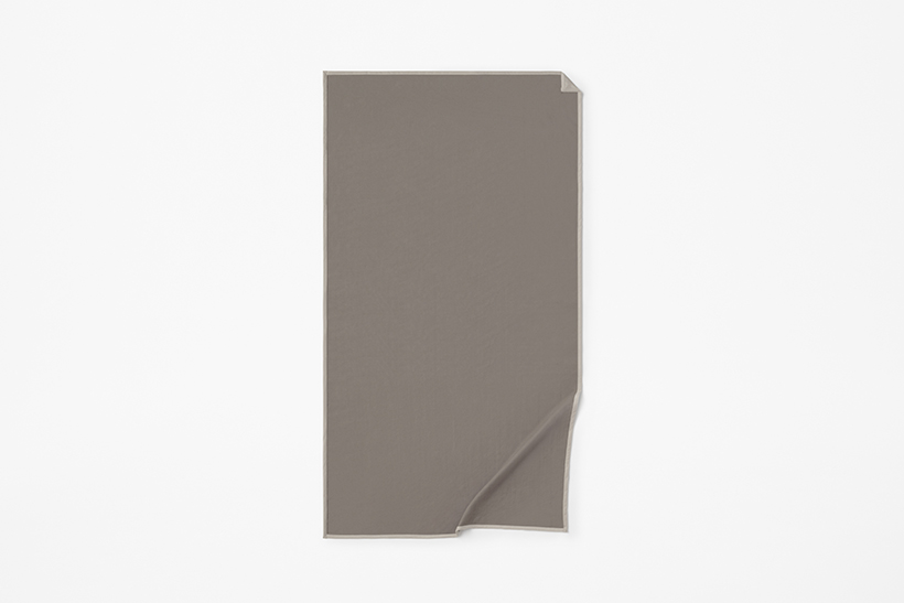
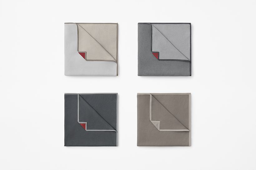
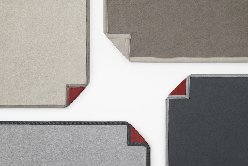
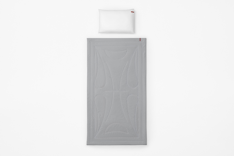
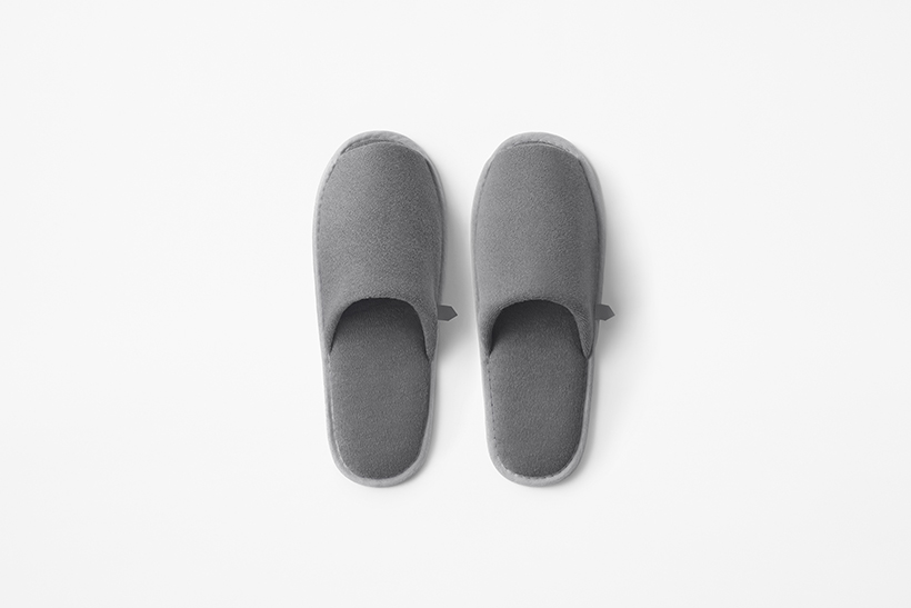
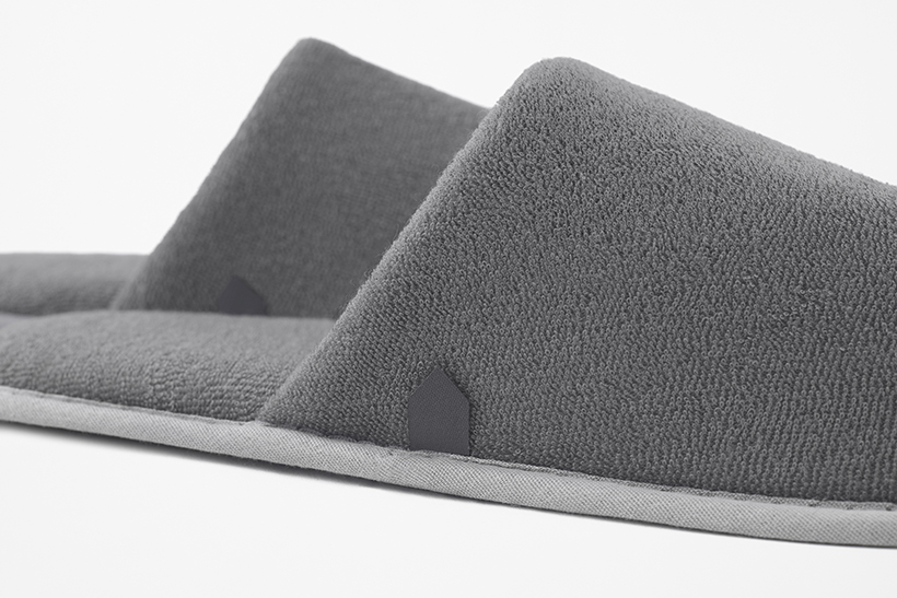
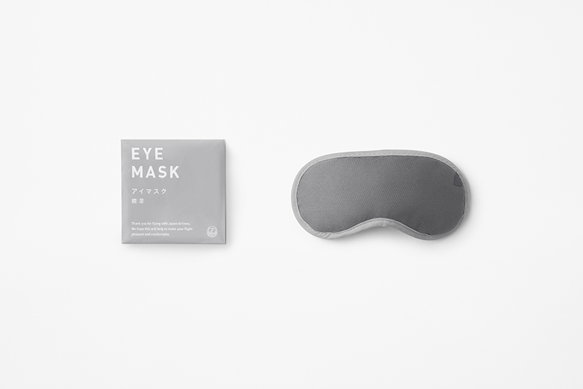
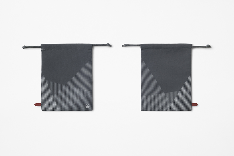
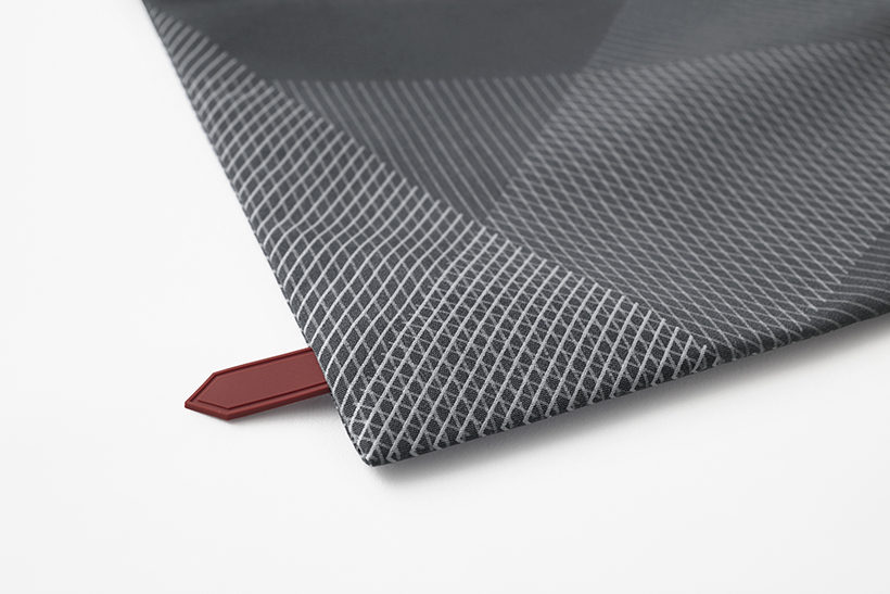
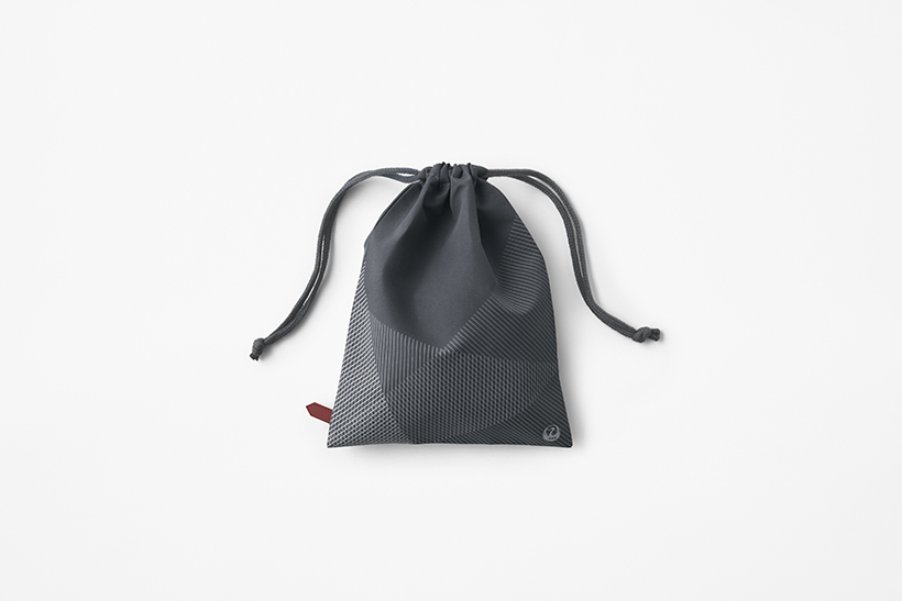
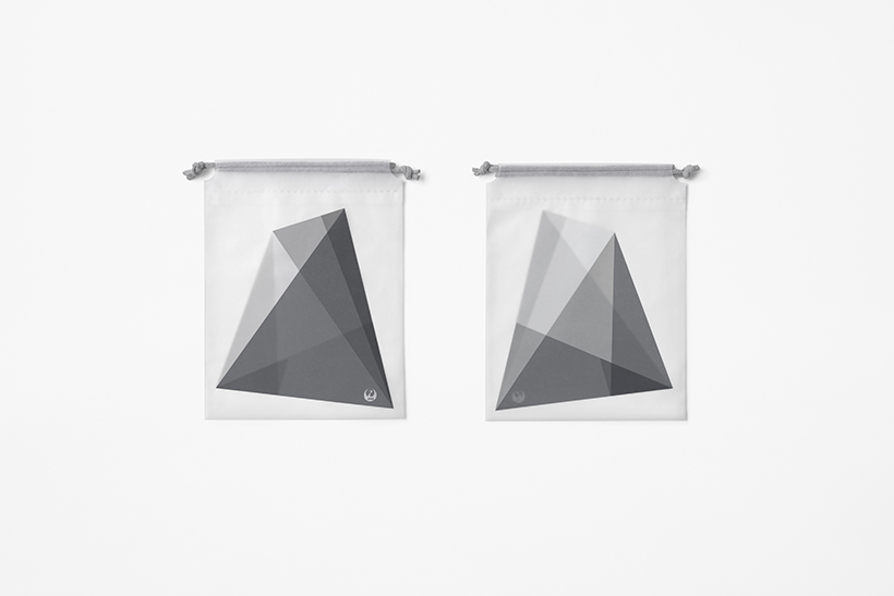
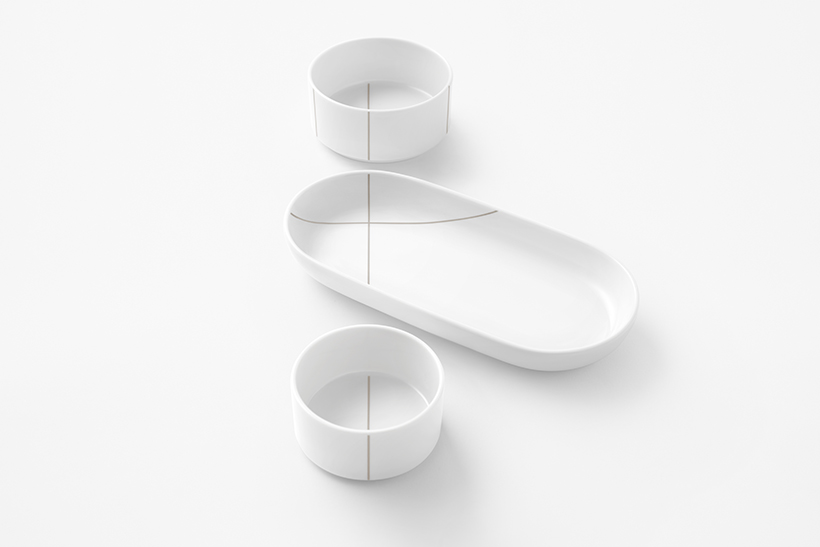
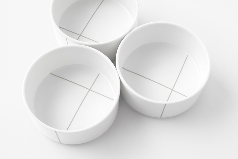
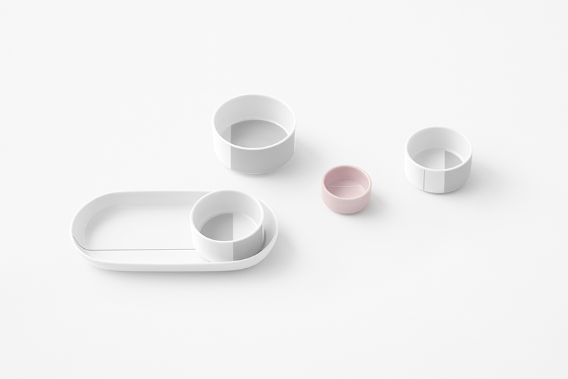
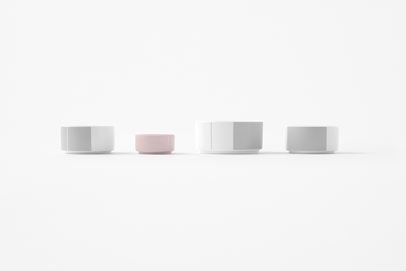
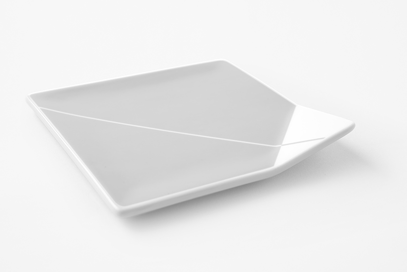
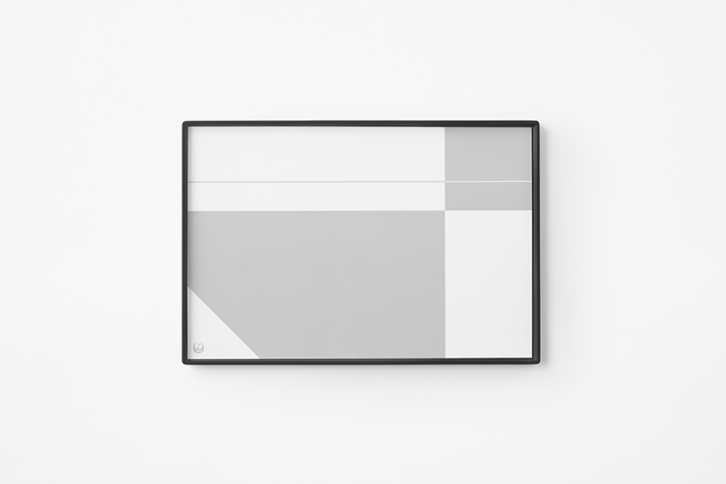
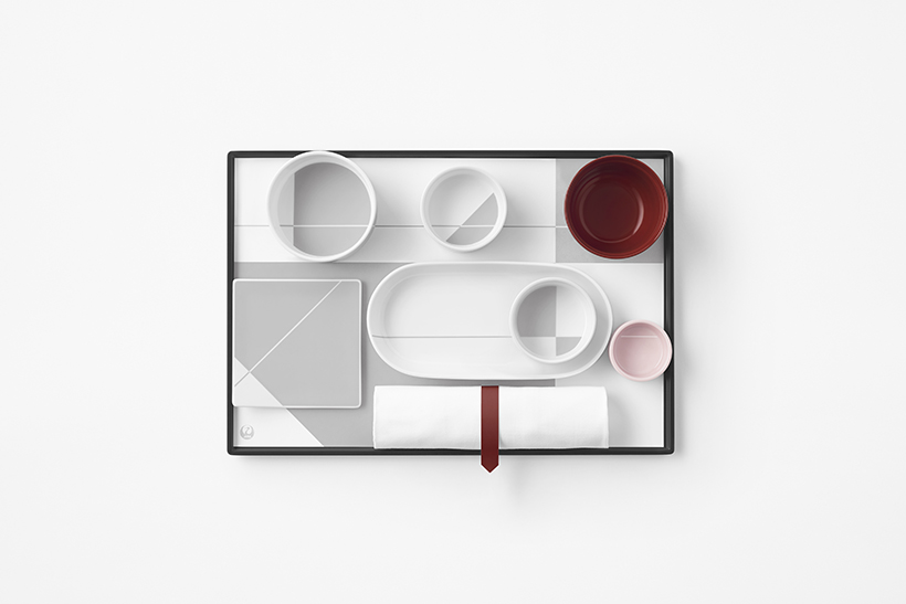
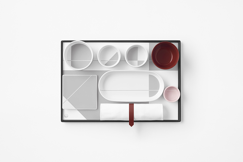
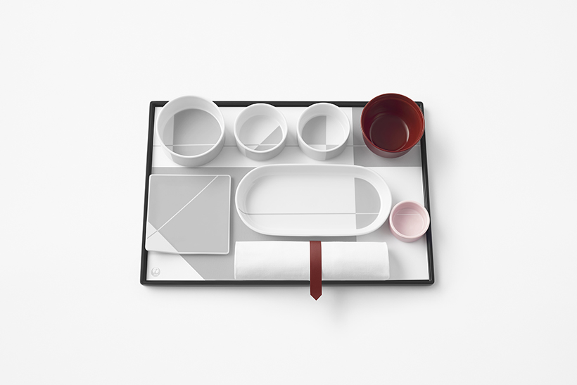
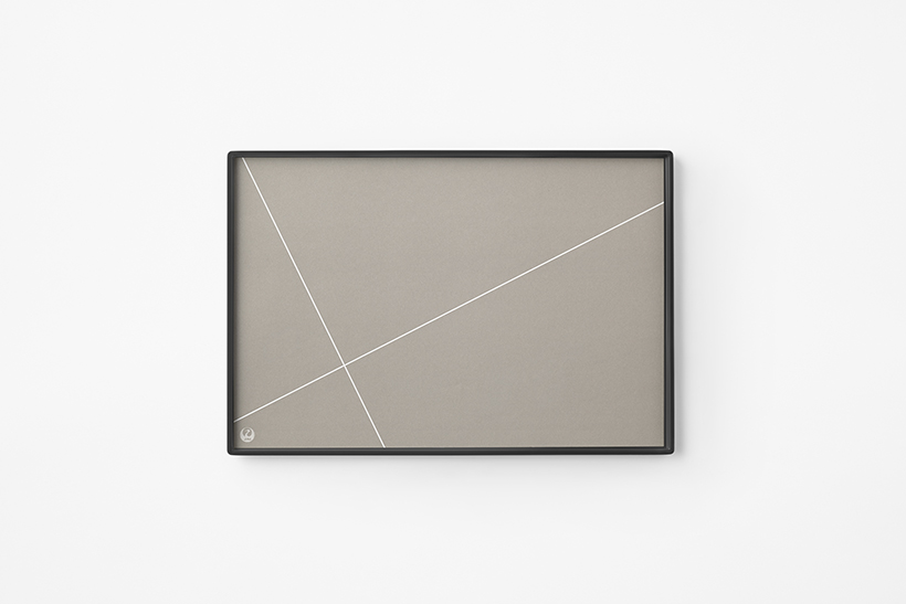
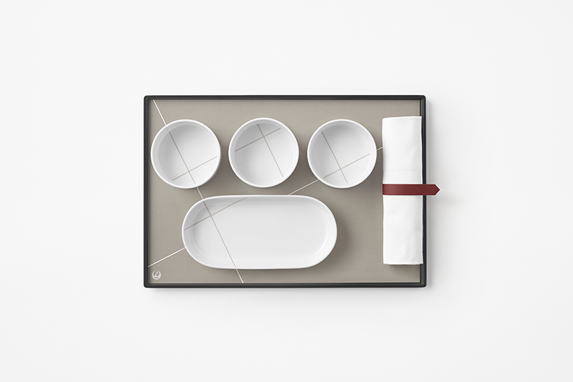
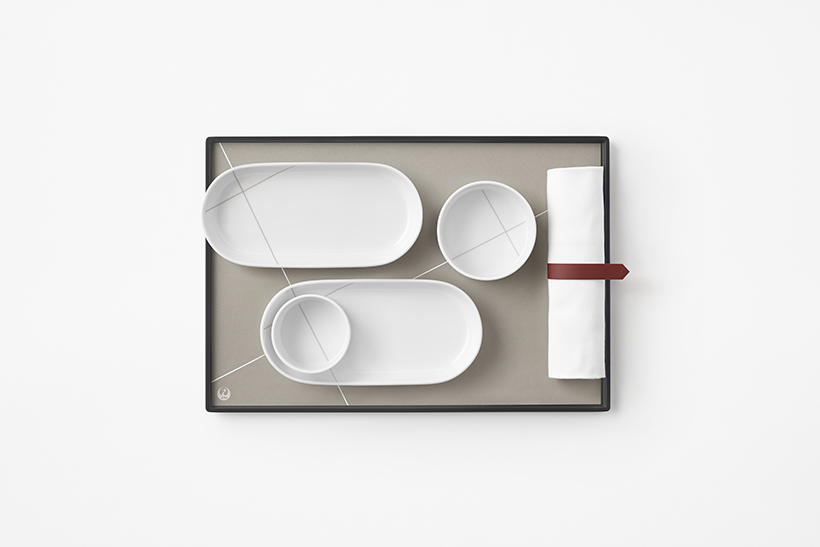
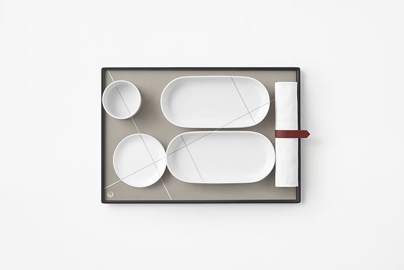
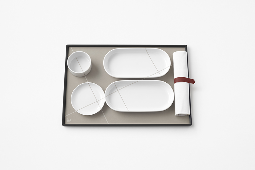
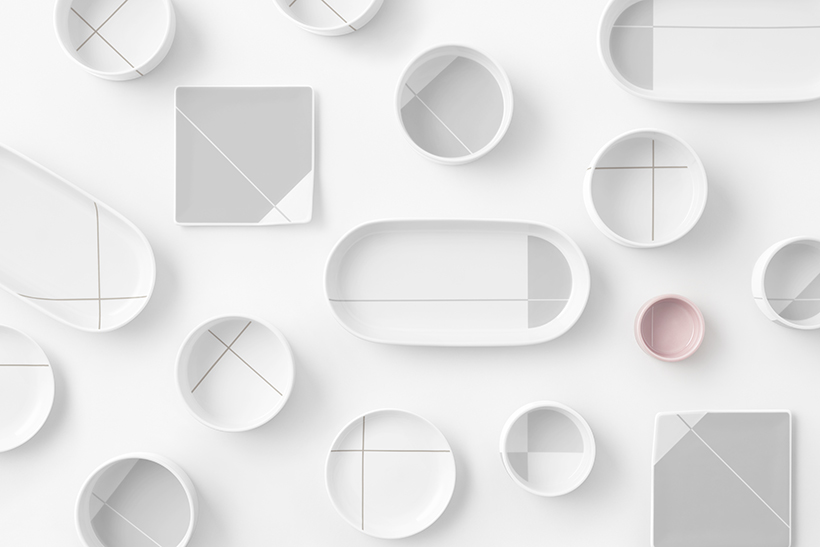
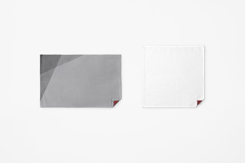
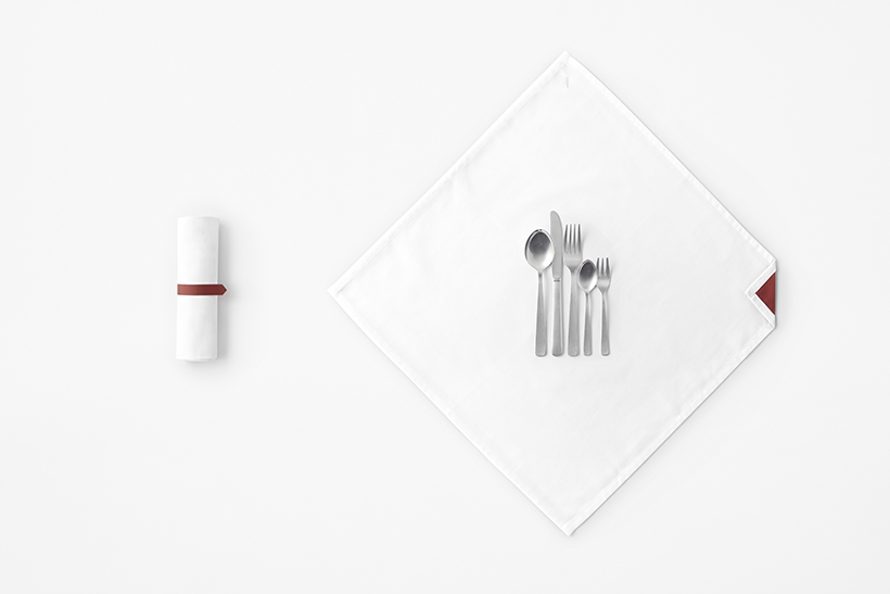
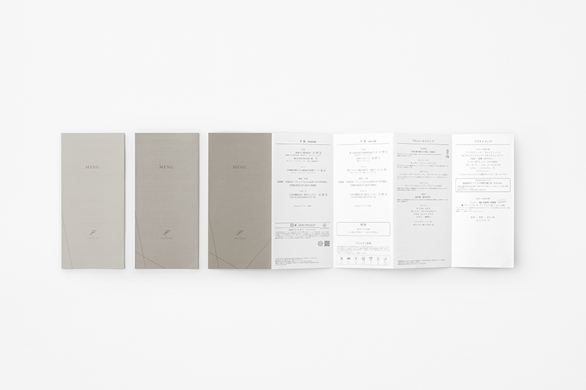
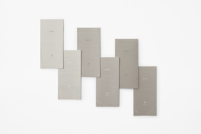
Tags emulating the paper crane’s wings are used for items such as cardigans, eye masks, slippers, and cutlery bands. Blankets, tablecloths, napkins, and other rectangular fabric items bear the detail of a folded corner, in the image of the crane’s head. Further, the pattern for folding a paper crane is employed as a design element on pouches, menu cards, and the like. The number and colours of folds are differentiated so the cabin crew may distinguish the menu cards, which may differ from flight to flight. The design conceived is one wherein similar patterns are applied to tray mats and tableware on domestic flights, with lines from the folding pattern revealed by arranging and stacking tableware for a sense of visual unity, while still depicting change according to changing menus.
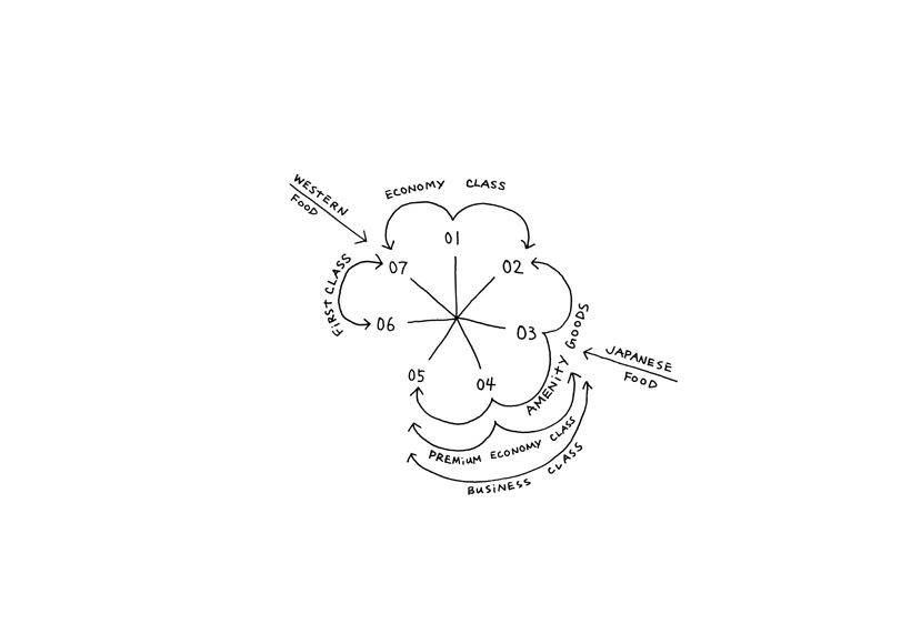
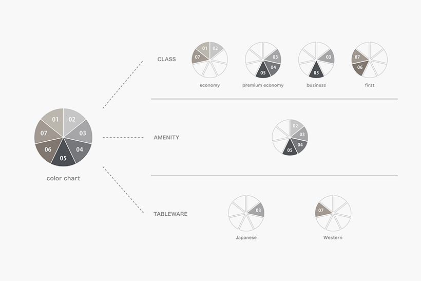
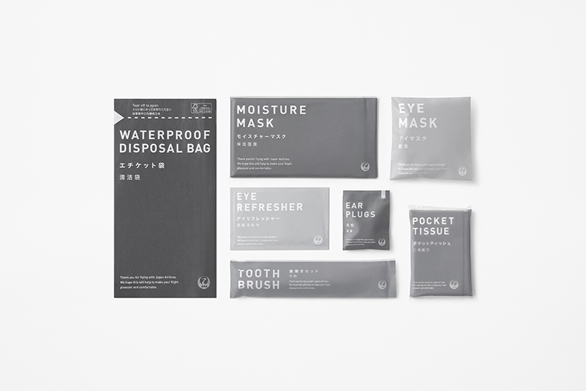
Although the process colour to accentuate the red paper crane motif was gray initially, items on international flights would be printed and manufactured in different countries and regions, complicating the task of detailed colour matching. Therefore, seven distinct grays were prepared, to be combined in appropriate mediums and places.
First, cool and warm grays distinguish Japanese food from Western food.
Next, each of the four classes are themed not with singular colours but with two or three grays each. In this context, partially overlapping the same colour intentionally adds distinguishing elements while unifying design within the cabin.
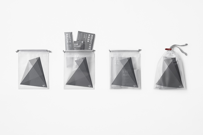
First class was assigned a calming, warm gray, while light gray and dark gray are combined for business class’s colour to give a sharp and modern look. Three light grays were mixed for the airiness desired for economy class. A neutral gray to fit seamlessly into any class was used in the packaging for masks, earplugs, tissues, toothbrushes, and other consumables. Instead of consolidating to a single colour as before, four colours were integrated and varied in advance to avoid the risk of inconsistent colouring during manufacturing.
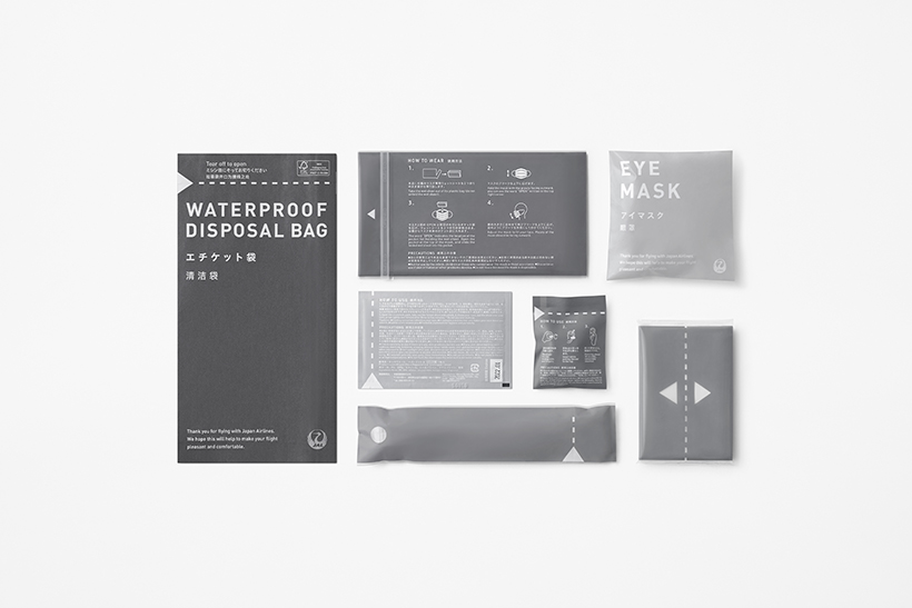
Textual elements are displayed as clearly and large as possible on each package in three languages: English, Japanese, and Chinese.
Though different from item to item in the past, package openings and the direction in which to tear them were unified with triangular and dotted line elements out of consideration for ease of use.