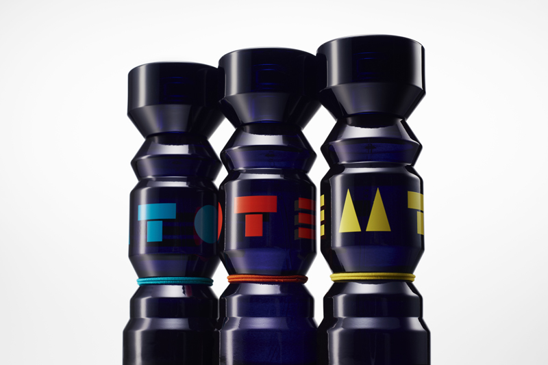
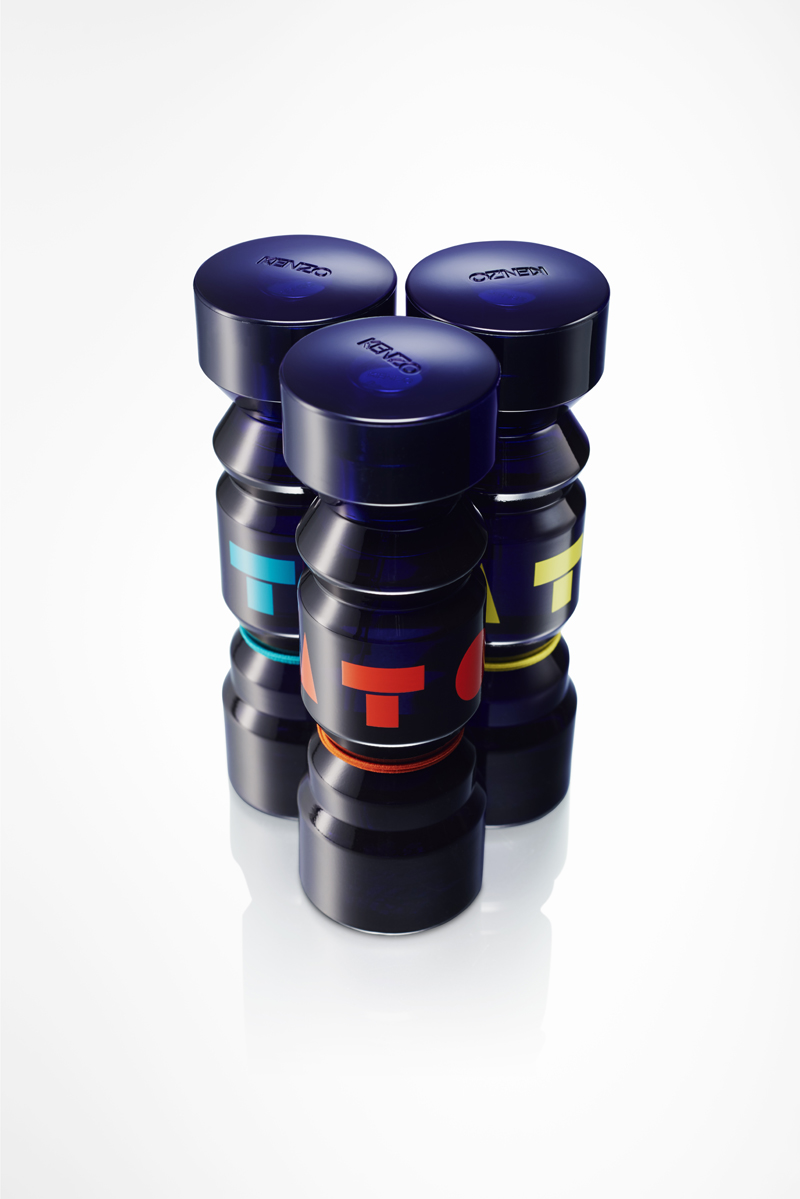
TOTEM
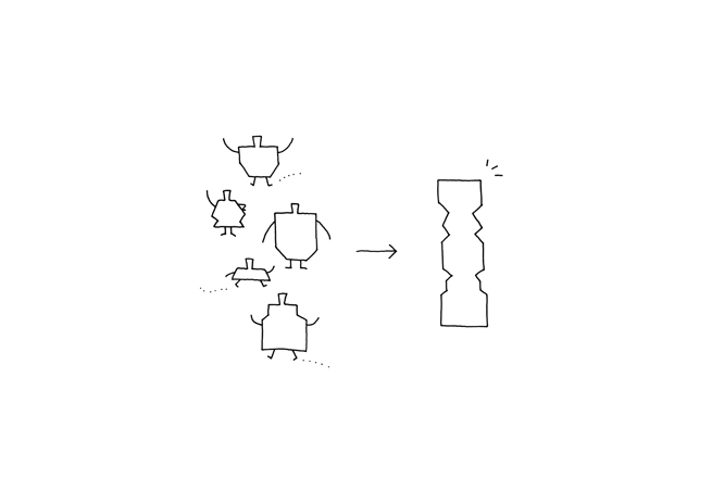
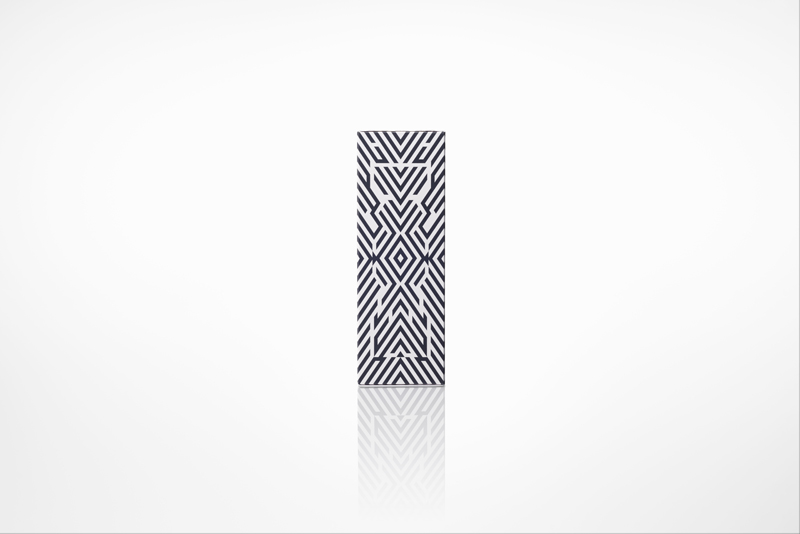
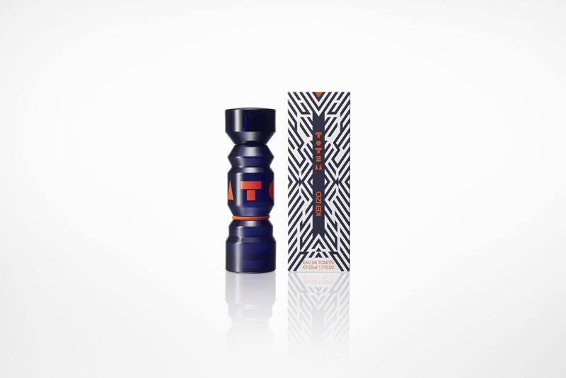
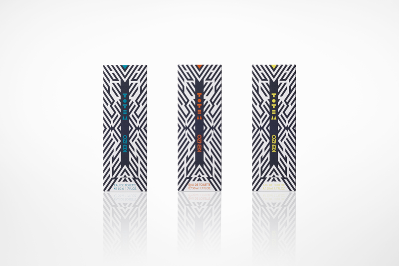
The new bottle and logo design for the newly launched fragrance TOTEM, directed at a new generation and developed by KENZO PARFUMS in Paris. Where previous generations have felt differences of nationality, language, and religion more acutely, the younger generation of today have comparatively fewer cultural divides to cross, enjoying a greater shared sense of identity through the global spread of online media and applications. This flexible and upcoming generation, with their mobile and vibrant lifestyles, are like a new ‘tribe’ in modern life, and this new unisex fragrance has been developed to symbolize their interconnectedness. The bottle is made out of dark purple glass, and the various layers of its form resemble a traditional totem pole, while the bottle and cap merge into one another to create an overall solid and monolithic design. The fragrance itself comes in 3 variants, differentiated not by any kind of label but a simple colored string; the woody citrus yellow, the woody floral orange, and the woody fruity blue. The logo for this collection consists merely of a square, circular, and triangular mark, and this simplistic and bold design is a highly symbol-oriented attempt to capture and blend the primal with the transnational; two defining essences of the generation at which this new fragrance is aimed.