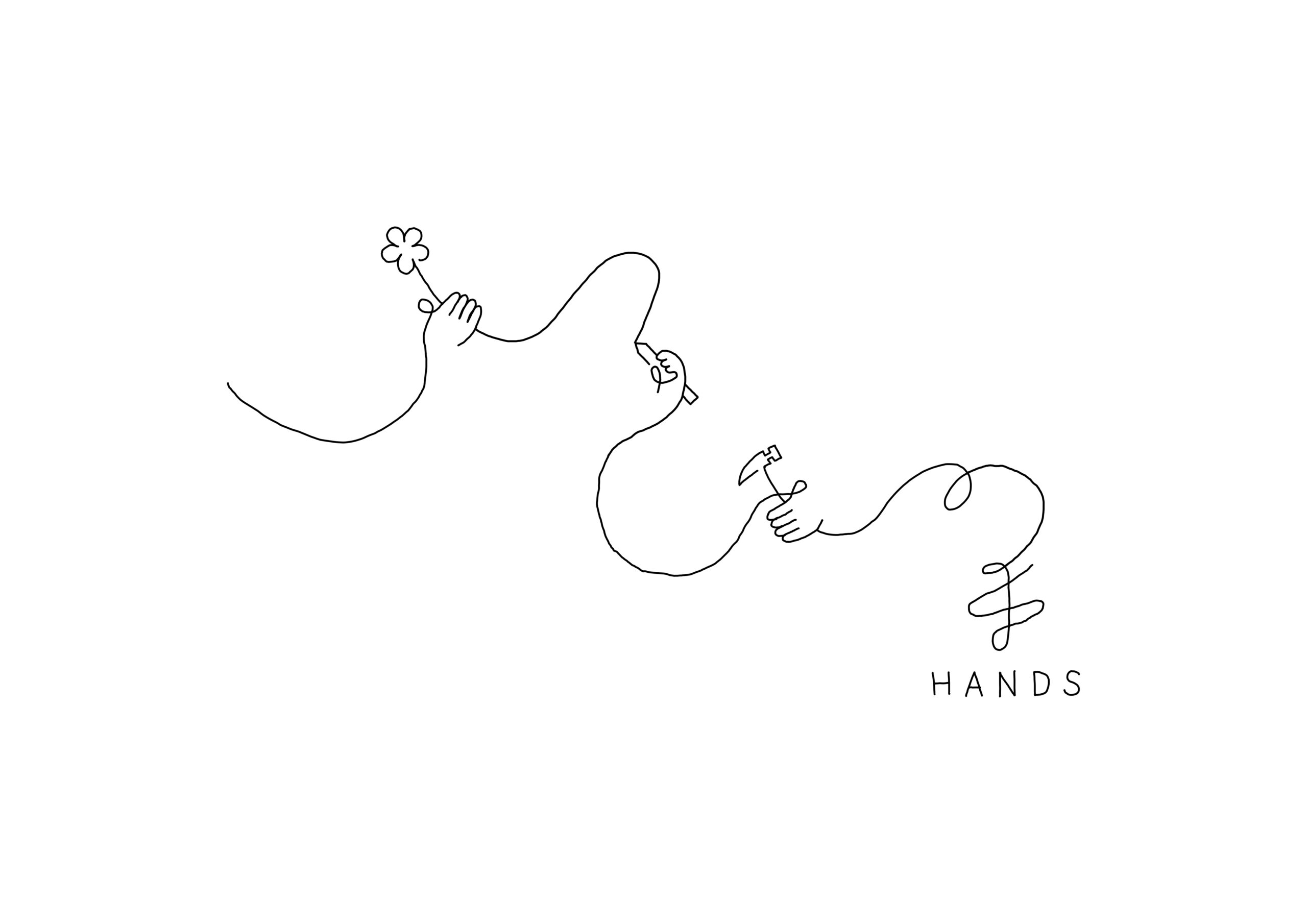

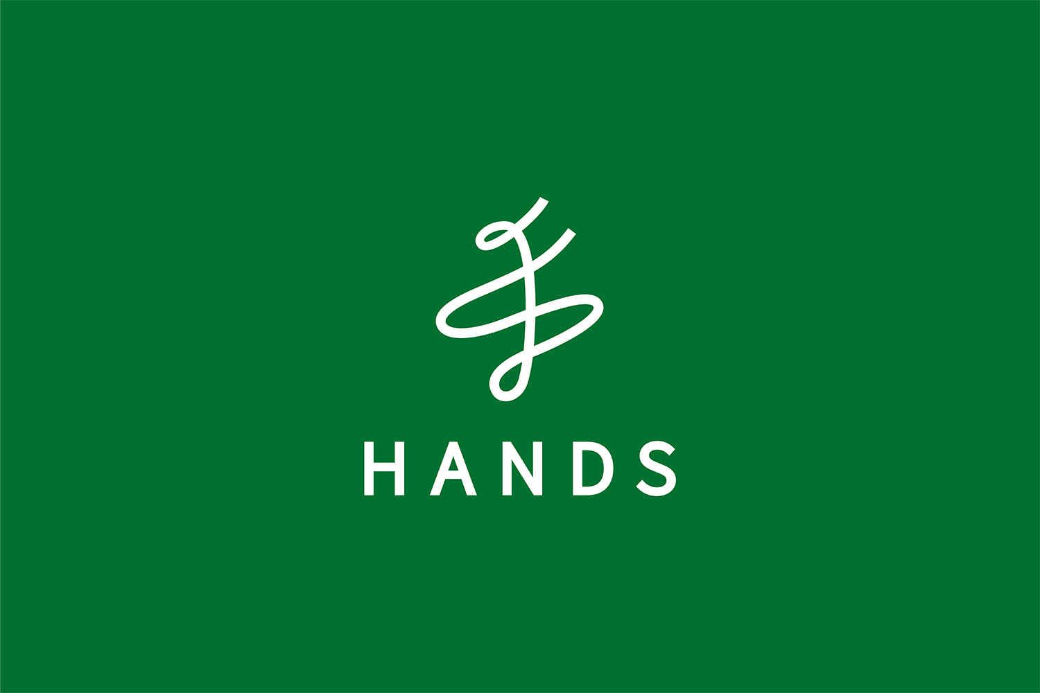


HANDS
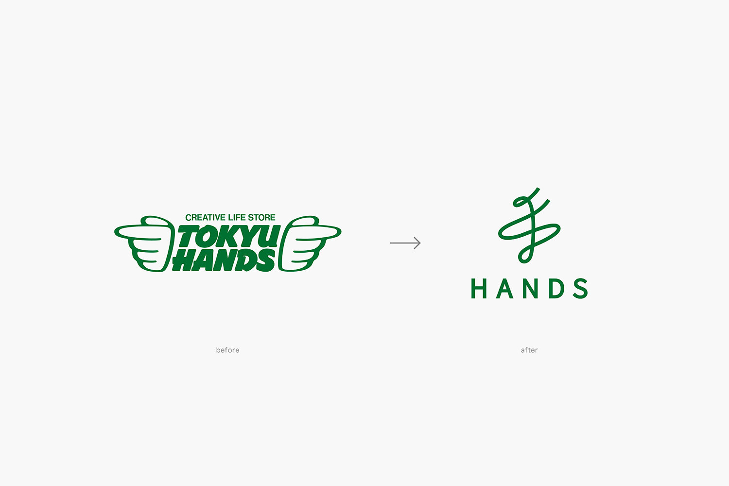
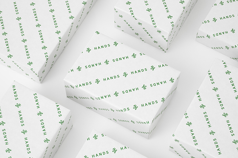
The brand renewal project for HANDS, a retail company established in 1976 that offers a wide range of products, now operating a total of 63 stores in Japan and abroad.The brand retains the well-known nickname “HANDS” and the deep green color to carry on the values that have been inherited since the company’s establishment as TOKYU HANDS.
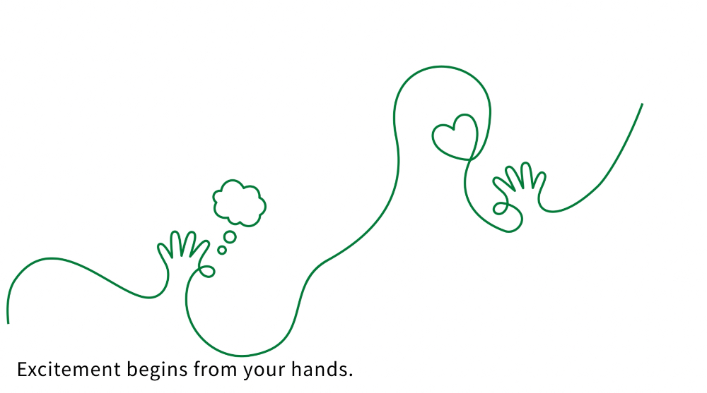
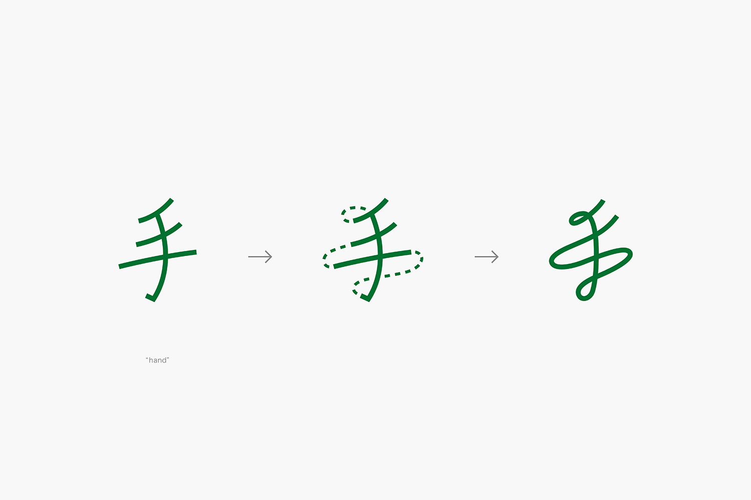
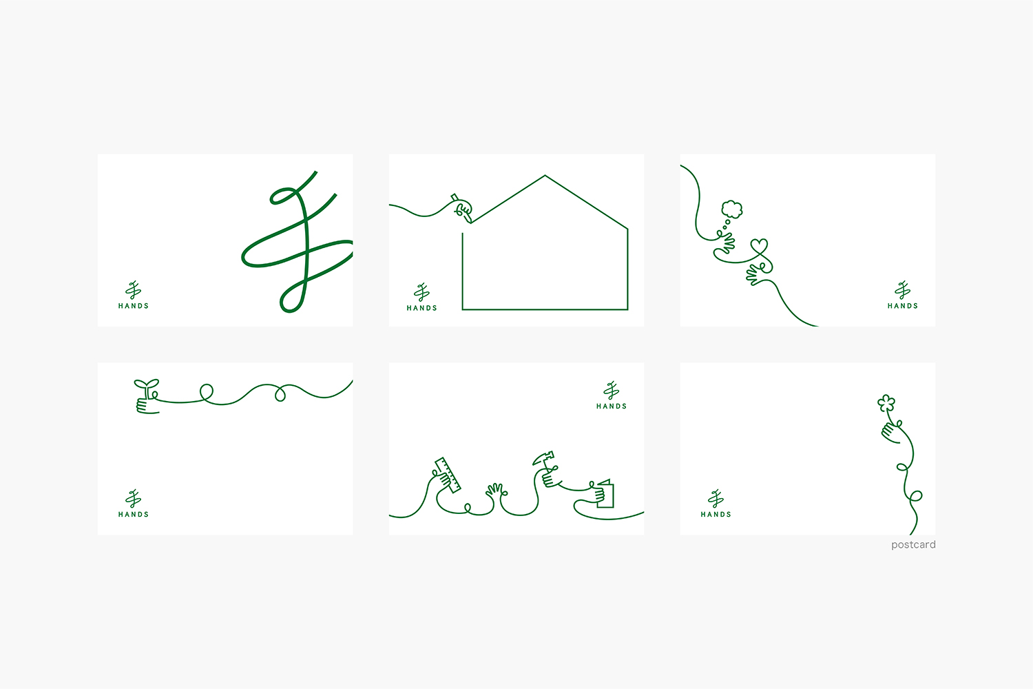
On the other hand, following the brand’s philosophy of creating lifestyles with own hands, the new logo uses a Chinese character meaning “hand” to give the impression of Japaneseness in abroad. The single stroke writing expresses the hope of connecting the past and the future.It is reminiscent of the previous logo with its long-known motif of “hand wings”, as well as evoking the image of people dancing with excitement.
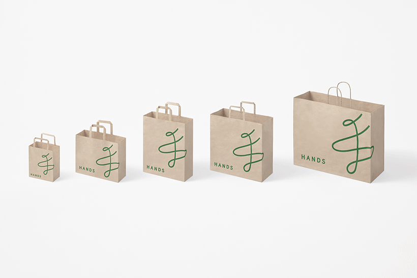
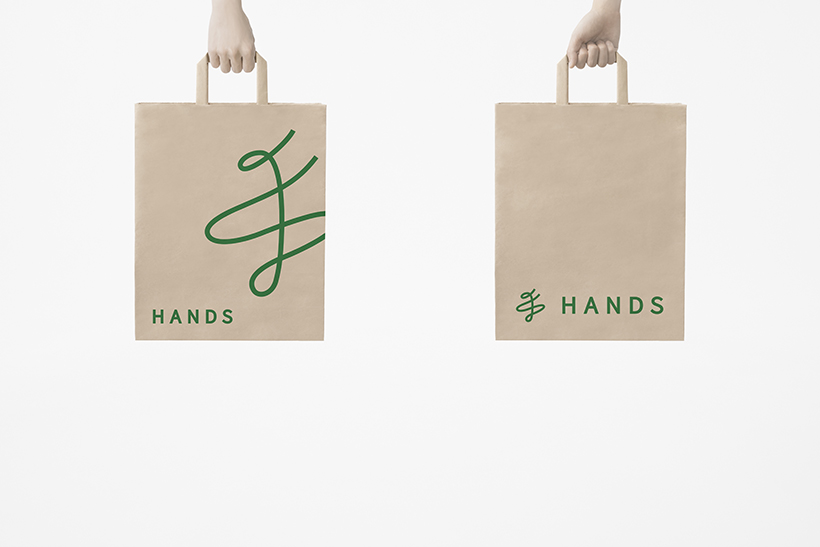
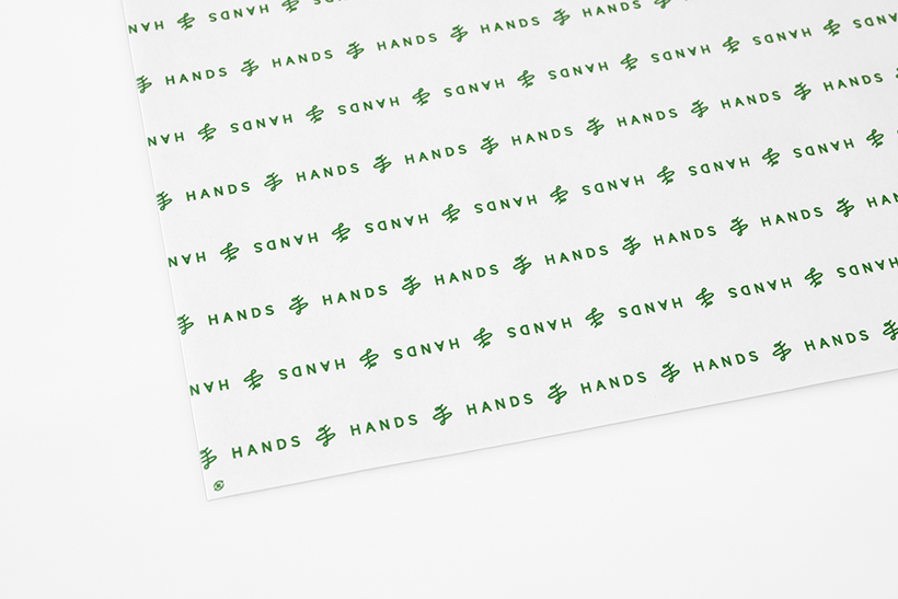
The goal is to build a consistent brand image by developing the single-thread expression into a wide range of touchpoints, including advertising visuals and in-store signage plans.