Pokémon Trading Card Game Scarlet & Violet
The Pokémon Trading Card Game features the characters of Pocket Monster on paper cards, which has been enjoyed by many fans worldwide over the years since its launch in 1996. In the design supervision of “Pokémon Scarlet” and “Pokémon Violet” as its 15th series, the goal was to update the design through repeated discussions and collaborative verifications, in parallel with the conventional card face design by Creatures, Inc.
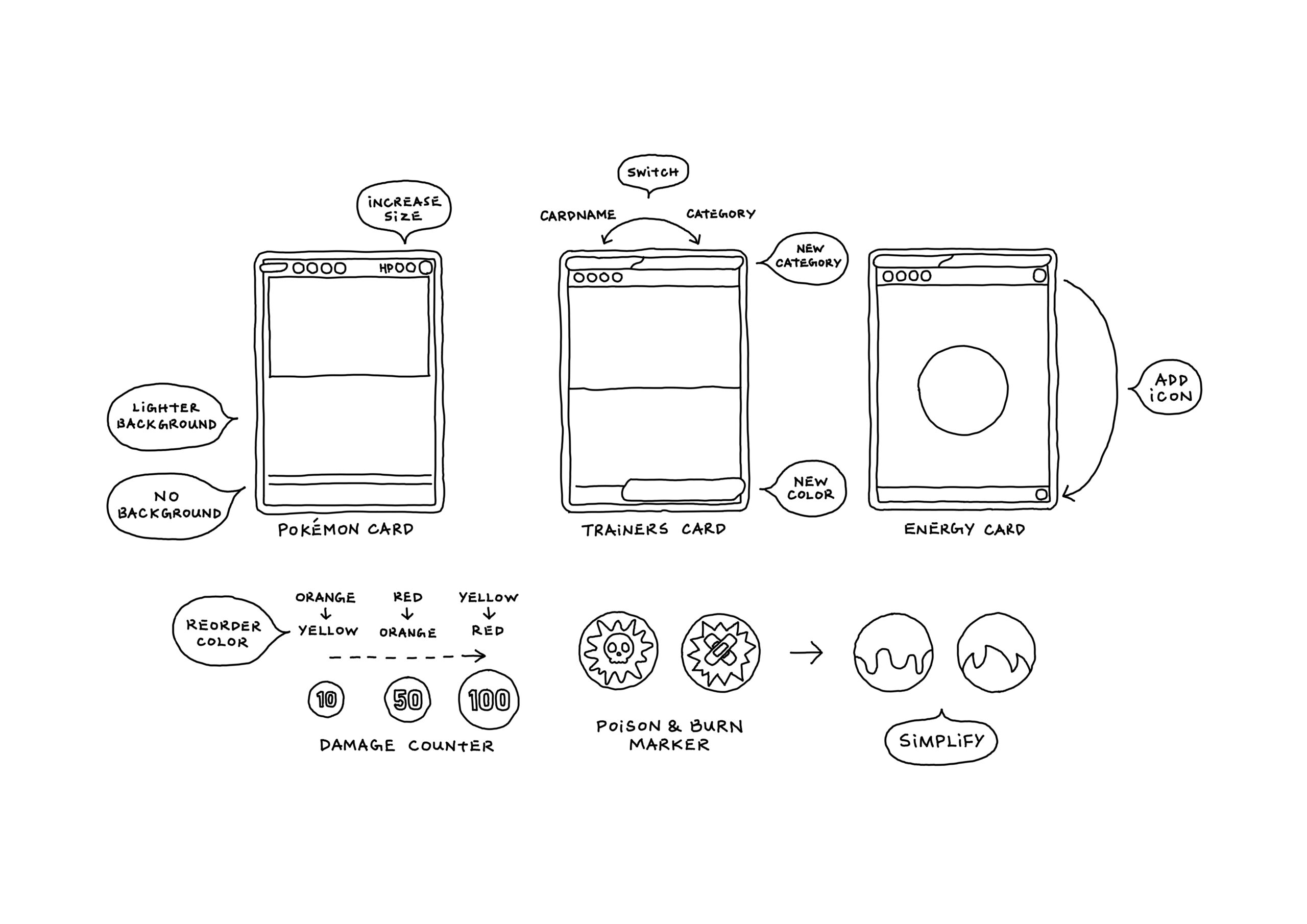
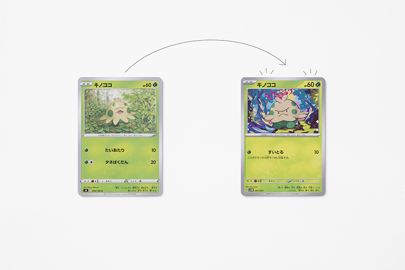
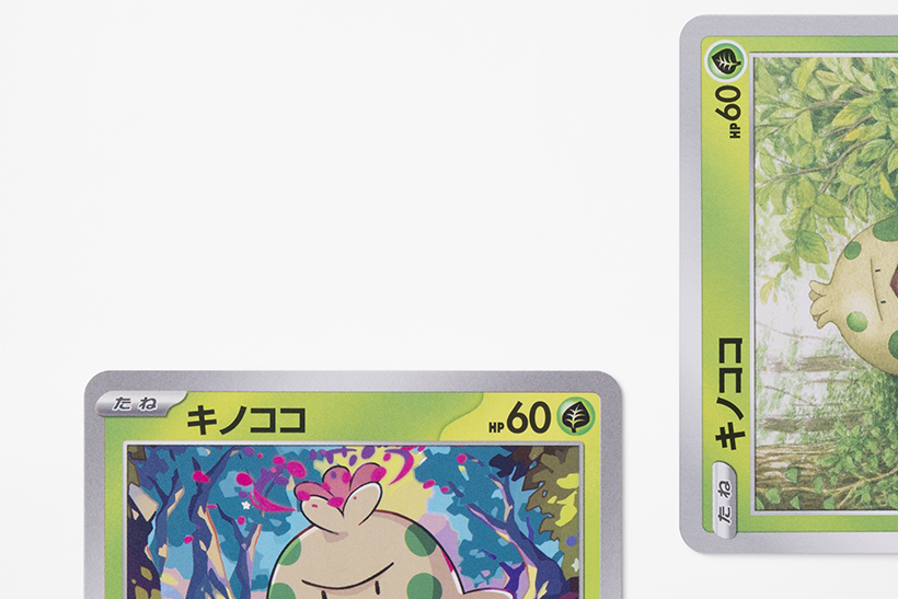
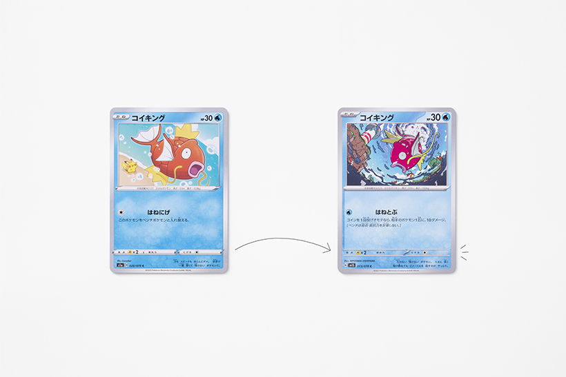
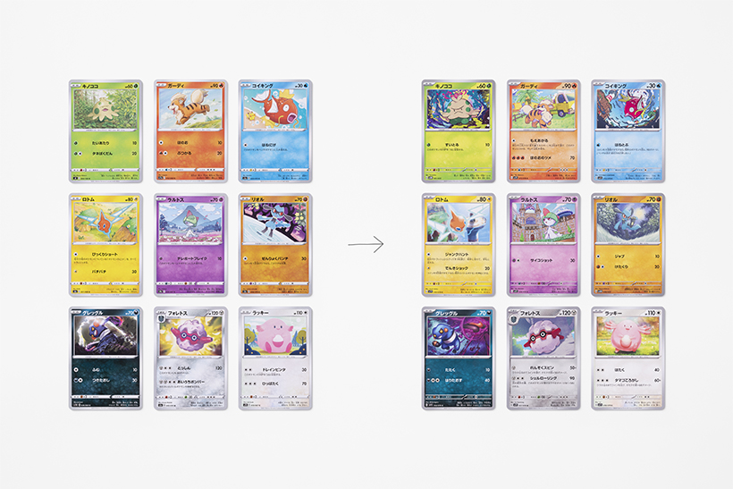
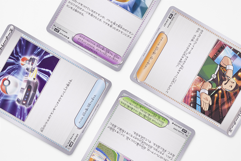
The first step was to break down the cards into approximately 24 components to analyze the card name, HP, attacks, evolution information, background color, card frame, and Pokedex information individually. The process aimed to verify the consistency between the order of priority and placement of information required for gameplay, and to determine which elements would be hidden when the cards are fanned out in hand. After simulating the legibility of the image-processed indistinct text, the final 11 elements to be updated were derived from a long list of considerations.
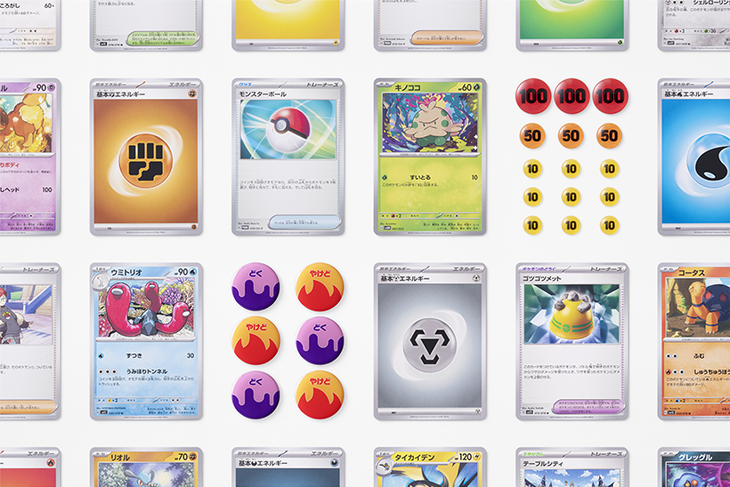
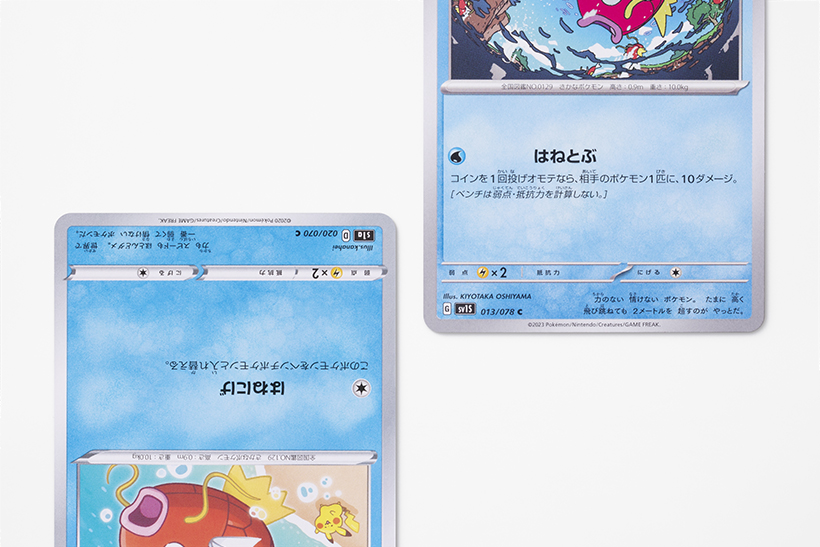
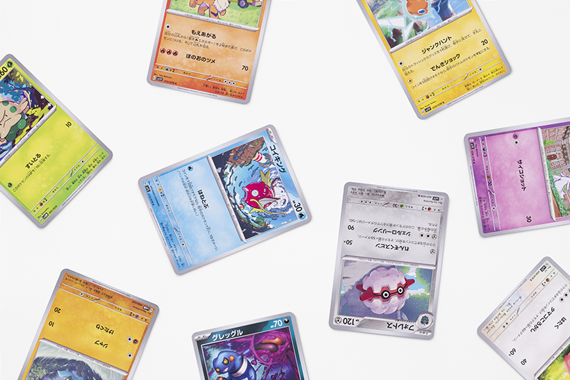
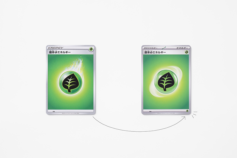
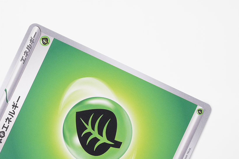
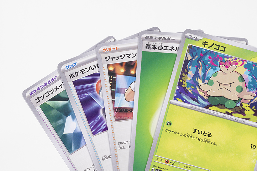
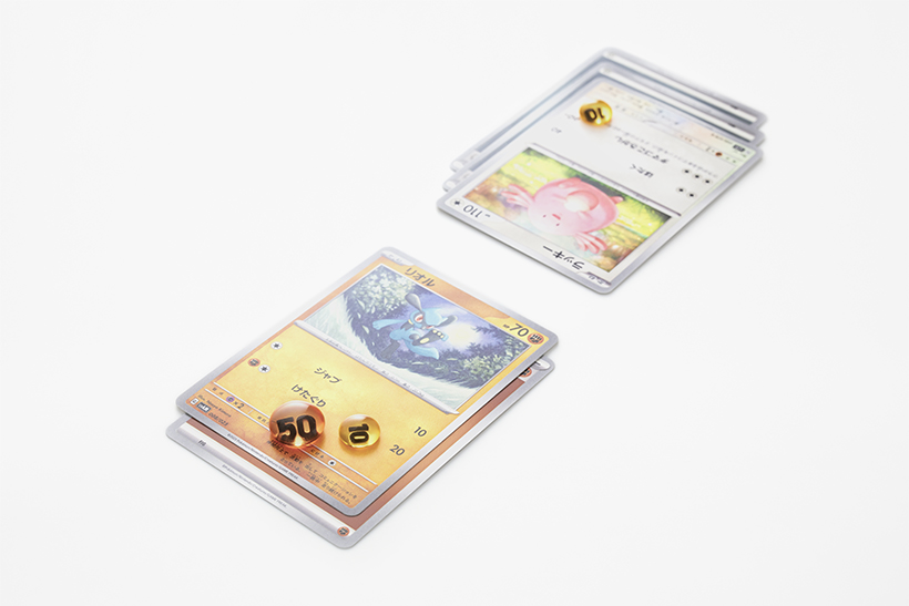
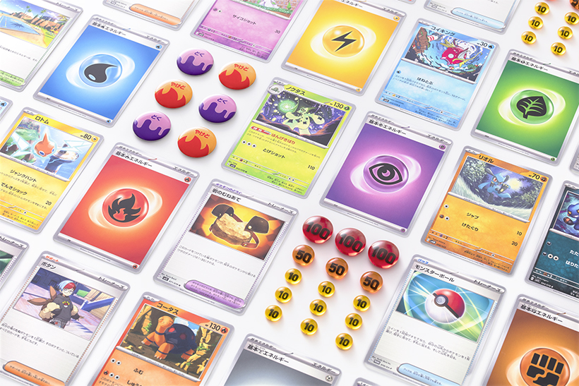
Among the three types of cards, the visibility of those of Pokémon characters was improved by reorganizing the font on the card name, enlarging the HP display, and adjusting the brightness of the background color used for attacks and HP. The strip indicating “weakness, resistance, and escape” was made less conspicuous with an aim to clarify the order of priority of the information necessary for the match. A type icon was also added to the lower right corner of the Energy Cards, which are to be attached to Pokémon cards when using attacks or escaping to the bench, so that they can be identified even within multiple cards layered on the board.
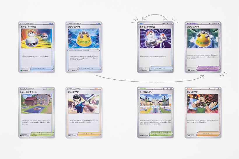
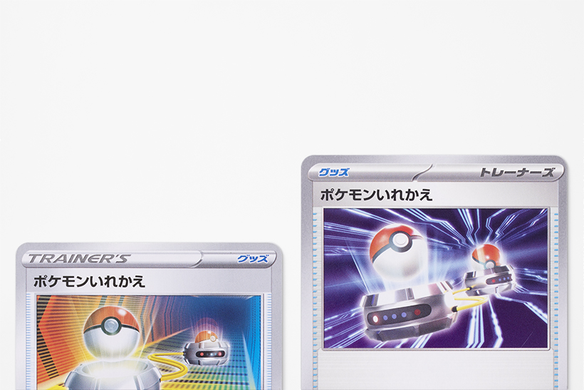
The positions of the indication of the upper category “Trainer,” which exerts useful effects in a battle, and the lower categories “Support”, “Goods”, and “Stadium” were reversed to prevent information from being hidden when Trainer cards are in hand. “Pokémon Tool” were also assigned new colors, separately from the “Goods”.
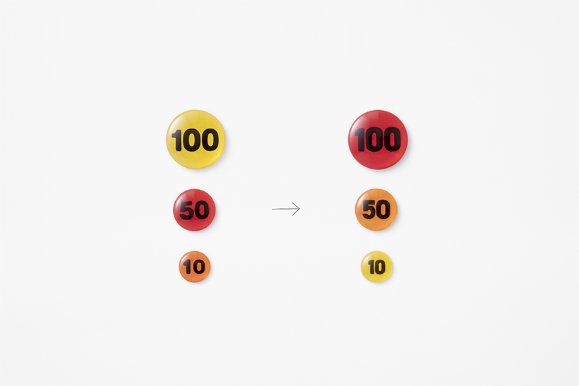
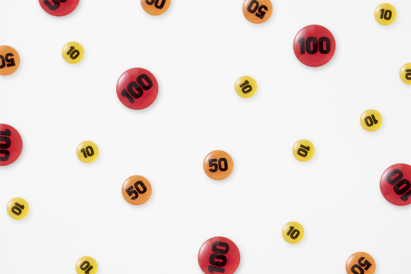
The damage counter used for recording was only available in 10 (orange) and 50 (red) in the initial series of the Pokémon Trading Card Game, where the redder number was determined to be the larger number. However, when a value of 100 was added with the increase in the number of Pokémon with high HP values, yellow was chosen for the color due to the difficulty of further increasing the redness over red. Therefore, the original color scheme rule of 10 (yellow), 50 (orange), and 100 (red) was adopted again.
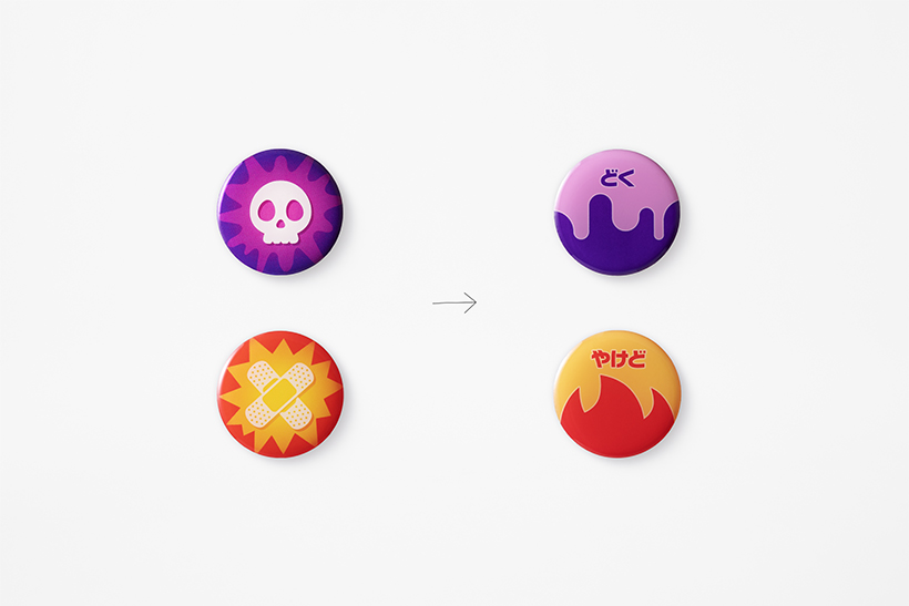
The markers indicating Poison and Burns have been changed from the traditional crossed-out bandage icon to a flame icon to make them more intuitively recognizable to international players. To match the tone, the Poison icon has been changed from a traditional skull to a liquid-like icon.
These updates will hopefully help players enjoy the Pokémon Trading Card Game with more ease and comfort than ever before.